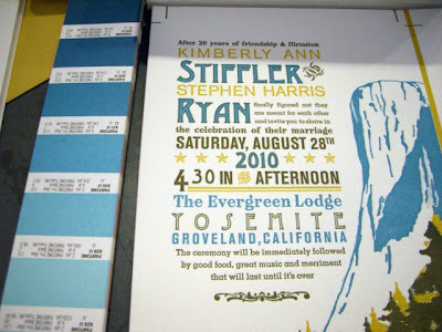
This invite was on press for 2 days, just finished the last run yesterday. Yay! Mixing color isn't an exact science. There are days when it takes 5 minutes to match a color. Other days, it can take me all afternoon--you just never know. Plus with letterpress, inks tend to print less saturated and may show up lighter even when you've mixed the color to the exact value. So, you have to calibrate for this (some clients like the look others prefer the color to look more dense). You can over-ink the press, but you have to be careful not to compromise the type. Or you can trip the press and ink the plate twice before printing--this gives more control but will take you twice as long to finish the job.
For this job, I didn't do either of those tricks. I actually decided to mix opaque white (as opposed to transparent white) to the blue and yellow colors. This gives the ink more density so it tends to sit solidly on top of the paper, making the colors pop a bit more. The color-mixing gods were on my side this week and I had a great time matching the colors to the Pantone. Thank you! Plus, I love how the colors look on the rollers :) All in a day's work! --or I guess in this case 2 days...
The yellow I wanted actually didn't exist in the Pantone book--this happens all the time even though there are a bajillion colors in this book--so the final mix is actually a bit brighter.


No comments:
Post a Comment