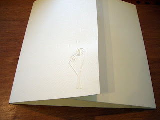
Since then, my client, Adele, was able to make it to the shop to make some decisions on the details. We had a great time getting to know each other, pulling some samples of decorative paper, and chatting about Italy :) I learned that August is the worst time to travel there since the entire country shuts down for vacation. What a brilliant idea! Why don't we do that here???

These are samples of the papers we would use for layering. She wanted the paper to have the same lightweight quality as the fabric of her wedding dress, such a great way to tie everything together! I love her ideas...So now the invite will be varying shades and textures of white.

As I mentioned, Adele and her fiance, Brendan, are architects. Being designers themselves, they brought a lot of concepts to the table. I really enjoy collaborating with my clients because the final product always becomes something that was really unique to them since they helped envision it.

Adele designed this beautiful logo of a flower that resembles a fiddlehead fern, and keeping with the white on white theme, the logo was blind embossed on the flap of the pocketfolder.
Next will be the ink colors, and then we're ready to print! Will keep you updated...


No comments:
Post a Comment